This is a preview of your video. Customize your viewer experience and add your own logo and branding.
Customize your theme
Upgrade to add your own logo
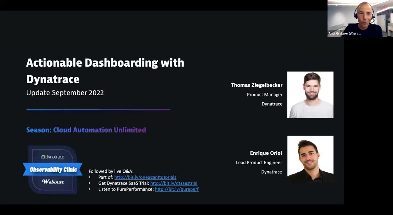
Actionable Dashboards for DevOps, SRE, and k8s with Dynatrace - Update September 2022
Dashboards are the window to your observability data and enable DevOps, SREs, Security & Platform Engineers, Cloud Native Architects, and Businesses to make better decisions.
In this Observability Clinic, Thomas Ziegelbecker and Enrique Oriol are back to give you an update on the latest dashboarding enhancements in #Dynatrace. They show us how to build actionable dashboards using dynamic and relationship filtering, exporting graphs and tables, consistent coloring, presets as well as usability improvements requested by our community.
Chapter List: 00:00 – Introduction 04:09 – What you will learn today 02:45 – Overview of Released Improvements 05:00 – DEMO of Improvements 36:17 – Data Explorer Upgrade Explained 38:30 – DEMO of Tile Upgrade 43:37 – What's coming up next